Most conversations about branding and packaging design begin with what a product looks like. This one begins with what it feels like.
Structural branding is the discipline of designing the three-dimensional physical form of a package — its shape, material, weight, closure, and dispensing mechanics — as a deliberate carrier of brand meaning. It is the architecture beneath the graphics, the skeleton beneath the skin. And yet, in most brand strategy conversations, it remains strangely overlooked.
The oversight is strategic, not accidental. Graphic design — labels, colour, typography — is visible, reproducible, and cheap to refresh. Structure requires moulds, tooling, and capital. Its results are permanent and tactile, resistant to easy imitation. The very qualities that make structure demanding to execute are what make it, done with intent, one of the most durable and defensible assets a brand can own. A label can be copied overnight. A proprietary form cannot.
This article traces structural branding across four dimensions: how form creates recognition before language does; how touch turns a visual promise into physical proof; how function determines whether design thinking survives daily use; and how sustainability, biomimicry and digital integration are reshaping what a package can be.
Across all four, one argument holds: structure is not the container of a brand. It is the brand — expressed in the one medium that cannot be scrolled past, muted, or ignored. It must be held.

Form Creates Recognition
Before a brand is read, it is held. Before it is understood, it is felt. In the milliseconds between noticing a bottle and picking it up, structure — not graphics — does the real selling.
Historically, packaging existed to protect and transport. Today that definition is incomplete. Packaging’s graphic surface — colour, typography, imagery — is its skin. Structure is its skeleton: the engineered form that determines how something is held, opened, poured, and remembered. Graphics work cognitively, through reading and recognition. Structure works instinctively — consumers feel it before they consciously interpret it. And because structure is expensive and slow to change, distinctive forms become powerful, defensible assets in a way a label never can. The Coca-Cola contour bottle and the Absolut apothecary bottle are proof that a three-dimensional shape can function as a long-term brand moat.
This matters most in the retail environment, where hundreds of products compete for limited attention. Cognitive psychology calls this pre-attentive processing: the brain detects shape and silhouette before it processes text or colour. A distinctive outline becomes a visual beacon, recognisable even in low light or cluttered shelves. This is the logic behind the “Smash Your Brand” test – if a package were broken into pieces and stripped of all graphics, would the fragments still be identifiable? If yes, the structure has achieved real equity. Tall, slender bottles read as elegant; short, dense forms read as potent; broad, utilitarian shapes read as value — all decoded before a single word is read.
E-commerce has intensified this. The physical package is now often the primary tactile touchpoint between brand and consumer, and unboxing has become ritual. The friction of a lid, the resistance of a seal, the sound of a tear strip – all of it is structurally choreographed. Too effortless, and the product feels disposable. Too resistant, and it frustrates. The right balance signals care. In an age where people film and share the moment of opening, packaging has become content, not just protection.
Shape also carries psychological meaning that goes beyond recognition. Every curve and angle transmits a signal. Humans are wired to recognise the human form – a bias called pareidolia – and structural branding uses this constantly. Curvaceous, hourglass silhouettes read as feminine: softness, fertility, approachability. The Coca-Cola bottle, nicknamed the “Mae West” for its pinched waist, is the clearest example; Jean Paul Gaultier’s “Classique” perfume bottle, a literal sculpture of a corseted torso, is another. Angular, broad-shouldered bottles read as masculine: strength and stability — the dominant language of whiskey and scotch, exemplified by Jack Daniel’s square bottle, chosen in 1866 to represent a “square dealer.” Research shows anthropomorphic shapes generate more favourable attitudes than generic cylinders, because they make a product feel like a companion rather than an object.
Geometry carries emotion too. Rounded forms are processed as safe – in nature, sharp shapes signal danger which is why dairy, lotions and baby products lean on circular geometry. Sharp corners signal precision and modernity, common in premium spirits and high-tech cleaning products, though excessive angularity risks discomfort; research on faceted water bottles found that edges need to be bevelled to avoid feeling aggressive.
Proportion distorts perceived value through what’s known as the elongation bias: tall, thin containers are perceived as holding more than shorter, wider ones of identical capacity, even though consumers tend to pour and drink less from them. At the other extreme, the “small is potent” heuristic explains why a 50ml jar of La Mer feels more valuable than a 500ml tub of something ordinary — heavy walls and a small cavity signal that the contents are precious and meant to be conserved.
Finally, asymmetry disrupts pattern recognition on purpose. Our brains are pattern-matching machines, and an asymmetrical form — like the J’adore perfume bottle — triggers an “orienting response” that makes people look longer to resolve the visual puzzle. Challenger brands often use this deliberately, disrupting the visual rhythm of the shelf to signal innovation.
Touch Makes the Promise Believable
Desire alone does not sustain a brand. Trust does — and trust is built by what consumers feel, not what they see.
Touch functions as haptic confirmation of the visual promise. This is “haptic transference”: the tactile qualities of a package are subconsciously attributed to the product inside it. If a bottle looks like gold but feels like plastic, the promise collapses on contact.
Weight is the most reliable proxy for quality in the consumer’s mind. Heavy glass reads instantly as luxury and heritage, which is why many brands add extra glass — a “heavy bottom” — purely for gravitas, not structural need. Texture carries its own emotional register: soft-touch, matte finishes mimic skin and signal gentleness and premium care, especially in beauty; high-shine finishes signal energy and freshness, common in youth beverages; rough, unpolished textures signal authenticity and craft, increasingly used in organic food and craft spirits.

Material itself is the substrate of structural branding. Glass remains the gold standard — inert, cold, historically significant, and its embossing serves as a permanent brand mark that can’t be peeled off like a label. Plastic has long carried associations of cheapness, though heavy-walled PET is closing that gap — as long as it avoids the auditory failure of feeling thin or crinkly, which instantly destroys value perception. Paper and fibre packaging, as seen in early paper bottles from Absolut and Carlsberg, introduces a new haptic vocabulary altogether: warmth, fibrous texture, dryness — sustainability signalled instantly through touch. The trade-off is transparency: when the consumer can no longer see the liquid, the structure has to carry the entire burden of trust.
Touch also governs ergonomics. The hand naturally seeks resting points, and a recessed waist — as in the Coke contour bottle or Method’s soap bottle — invites the hand to wrap around it, making the object feel like an extension of the body. In contexts like the shower, where hands are wet, texture becomes a safety feature: rubberised or textured grips prevent dropping and register, even subconsciously, as thoughtfulness on the brand’s part.
The Brand Has to Work
After emotion and material comes performance — and this is where design thinking is tested against daily reality. If a package fails to function elegantly, the brand is perceived as incompetent, no matter how it looks on the shelf.
Pouring is a critical, often invisible touchpoint. “Glugging” — the chaotic oscillation of air entering as liquid exits — causes splashing and a sense of carelessness. The geometry of the neck and shoulder determines flow stability; a long, tapered neck, as on a wine bottle, produces a smooth, laminar pour. In the spirits industry, bottles are also tools: a bottle built for a bartender’s speed rail needs a graspable neck and balanced weight, while an ultra-premium, oversized tequila bottle may look impressive but gets functionally resented behind the bar, quietly hurting on-premise sales.
Closures represent the first active step in the ritual of consumption. The torque required to open a cap is carefully engineered — too loose feels cheap, too tight causes frustration — tuned to give satisfying tactile confirmation of security. In pharmaceuticals and nutraceuticals, the shift from push-and-turn caps to ergonomic “pop & click” systems reflects a deliberate move toward inclusivity: easier for people with limited dexterity, while remaining child-resistant, effectively branding the product as caring and accessible. Even the choice between cork and screw cap is a choice of ritual — the cork signals ceremony and tradition through the theatre of foil, worm and pull; the screw cap signals efficiency and modernity.
For larger formats, the handle is the primary interface. Research on large water bottles found that specific finger indentations and handle width reduce slippage and perceived exertion. Method’s redesign of its dish soap trigger applied the same ergonomic empathy — recognising dishwashing as repetitive motion, they engineered a trigger that reduces finger fatigue, building loyalty among the people who use it daily.
Sound closes the loop. It confirms freshness, quality and intent before a product is even tasted. The pop of a jar’s safety button is a universal signal of sterility; its absence makes consumers instinctively wary. The heavy, low-frequency click of a luxury lipstick case — engineered to avoid any thin, plastic snap — signals precision and solid materials. The crack of a soda can or the hiss of a twist-off cap triggers a near-Pavlovian thirst response before the drink is seen.
Sound can also break a brand. In 2010, Frito-Lay released a compostable SunChips bag made from PLA. Structurally, it was a genuine sustainability win. But the material was so rigid it produced noise louder than a subway train when handled. Snacking is often a relaxed or quiet activity, and the bag made that impossible — triggering a consumer backlash so strong the brand withdrew the package, despite its environmental credentials. The lesson: structural innovation cannot succeed if it violates the sensory expectations of the moment it’s used in.
When Structure Becomes the Brand
A handful of case studies show what happens when structure is treated as a strategic asset rather than a container.
Coca-Cola’s contour bottle emerged from a 1915 crisis of commoditisation, when copycats with names like Koka-Nola were mimicking Coke’s straight-sided bottles. The brief to glassmakers was explicit: create a bottle recognisable by feel, in the dark, even broken on the ground. The Root Glass Company, working from a misidentified illustration of a cocoa pod, produced the bulbous, ribbed silhouette that became the “Mae West” bottle — patented in 1915 and eventually so recognisable that Coke could remove its own logo from advertising. Raymond Loewy called it “the perfect liquid wrapper.”
Absolut Vodka took the opposite path. Against a premium vodka market of tall, ornate, frosted bottles signalling Russian imperial heritage, Absolut’s team found an 18th-century Swedish medicine bottle — short, squat, utilitarian. They printed text directly onto the glass instead of using a paper label, communicating a “nothing to hide” clarity. The bottle’s stark silhouette became the hero of over 1,500 ads across 25 years, and sales grew from 10,000 cases in 1980 to 4.5 million in 2000 — proof that anti-design can become its own form of luxury.
Chanel No. 5 did something similar in perfume. Against the ornate Art Nouveau crystal bottles of the early 1920s, Coco Chanel wanted an “invisible bottle” — a clinical, laboratory-style vial with sharp lines, its stopper later faceted to echo the geometry of the Place Vendôme. The structural minimalism has remained virtually unchanged for a century, influencing the entire category.
Method disrupted a category that had never asked to be beautiful. Household cleaners were traditionally opaque, industrial, and hidden under the sink. Method hired designer Karim Rashid to create a teardrop-shaped, clear bottle with an integrated pump — designed to live on the counter, not beneath it. The shift in usage occasion justified a premium price and forced major competitors to overhaul their own packaging.
Smirnoff Caipiroska showed how structure can create a single, viral moment. To launch fruit-flavoured vodkas in Brazil, Smirnoff wrapped bottles in a textured sleeve mimicking real fruit skin, which the consumer had to peel off to open — engaging touch, sight and sound to simulate the act of preparing a cocktail, turning unboxing into ritual.
Together, these cases point to distinct structural strategies: contouring (organic, body-like forms, as with Coca-Cola), anti-design (utilitarian honesty, as with Absolut), minimalism (stripped-down austerity, as with Chanel), disruption (object-like forms that break category norms, as with Method), kinetic design (movement and transformation, as with Smirnoff), and haptic design (weight and material richness, as with La Mer). Each is a different route to the same outcome: structure operating as brand.
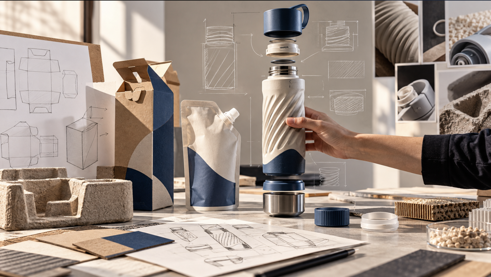
Structural Design as a Strategic System
Form, material, ergonomics and sound are not separate levers — together they reveal that structure actively shapes perception at every touchpoint, rather than simply containing a product.
And the returns are measurable. In India, 68% of urban consumers cite packaging as a primary driver of first-time brand trial. Gen Z and Millennial consumers in India show an 80% tolerance for price premiums on plastic-free packaging — higher than the global average. India also has one of the world’s highest “unboxing share” rates, with 45% of D2C shoppers reporting they share distinctive packaging on social platforms. And in India’s festive economy, the weight and reuse value of a container — steel, or premium glass — directly shapes how a gift is perceived.
Structure, in other words, is one of the few brand investments that compounds. Campaigns expire. Forms endure.
The Future of Structural Branding
Every advantage eventually expires, and structural branding now faces a new set of pressures: environmental accountability, technological disruption, and shifting consumer expectations. The challenge is no longer just building a better bottle — it’s building a structure that can survive the future.
Sustainability is driving the clearest shift. The Paboco (Paper Bottle Company) initiative, led by Absolut and Carlsberg, is developing bottles built from a structural paper shell — roughly 57% paper — reinforced with a thin liner strong enough to hold spirits or carbonation. Because these bottles are opaque, they force a real branding shift: brands that once relied on the clarity of the liquid inside now have to let the texture of the paper carry the message of responsibility.
Designers are also borrowing directly from nature. Honeycomb structures, inspired by beehives, deliver strength with minimal material, allowing lighter secondary packaging without losing protection. Hydrophobic coatings, inspired by the self-cleaning surface of the lotus leaf, let viscous products like ketchup or toothpaste slide out completely — cutting waste and easing recycling. And Notpla’s seaweed-based edible bubbles (Ooho) go furthest of all: a structure that is entirely natural and disappears after use, removing the idea of packaging waste altogether.
Structure is also starting to move. Pop-up popcorn bowls transform from flat disks into standing bowls using the heat of a microwave. Origami-based engineering is producing packaging that expands from flat-pack to full volume — cutting shipping footprint while making the moment of opening genuinely delightful.
And structure is starting to think. Films embedded with oxygen scavengers or antimicrobial agents actively extend shelf life, turning the structure itself into a preservative. Coors Light’s thermochromic mountains change colour with temperature, turning a label into a functional thermometer. NFC chips embedded in the caps of rare whiskies let a consumer tap their phone to verify authenticity — turning the structure into a phygital gateway between the physical object and a digital experience.
In each case, packaging is shifting from container to collaborator — preserving the product, communicating with it, sometimes disappearing responsibly after use. These are not experimental curiosities. Structural decisions directly influence recognition, pricing power and loyalty, which makes this commercial leverage, not design theatre.
Why Structural Branding Matters
Structural branding is the architecture of desire. It turns a commodity into an object of fascination, a liquid into a ritual, a brand into an icon — from the anthropomorphic curves of Coca-Cola, to the modernist austerity of Chanel, to the sustainable, fibre-based future being built by Absolut.
Going forward, packaging will increasingly be judged against three imperatives: sensory depth — engaging touch and sound with intention; functional empathy — ergonomics and inclusivity built into every interaction; and environmental responsibility — materials that heal rather than harm. Brands that master this balance won’t just be seen on the shelf. They’ll be felt, held, and kept.
Conclusion
Structure is never just a container. It is a system of signals, emotions and decisions engineered into physical form. From desire to trust, from function to memory, and now to responsibility, one thread holds across all of it: the most powerful brands are not built on appearance alone. They are built on experience.
The brands that endure will not be the ones that look best on the shelf. They will be the ones that feel right in the hand, work effortlessly in use, and adapt intelligently to the world around them.